
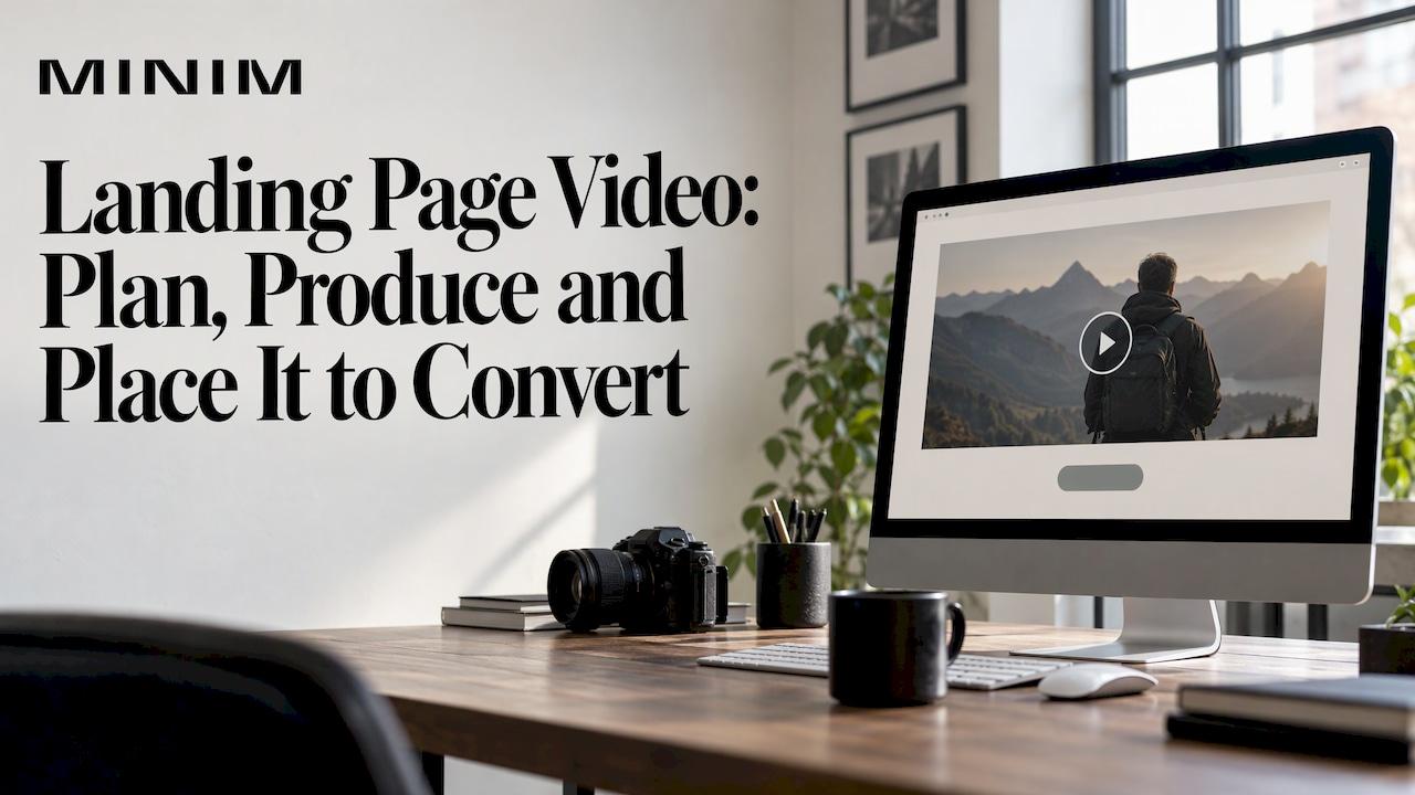
A landing page video works when it does one job for one visitor: it explains the offer fast enough that the visitor takes the single action the page asks for. Pick that action first, then script, shoot and place the video to serve it. A video built as a brand mood piece and dropped onto a page will be watched, and may still not convert. We run commercial production for agencies and brand teams, and the briefs that perform start with the page's conversion goal, not with the footage.
TL;DR
- Give the video one goal and one next step. A video that tries to do three jobs usually does none of them well.
- Spend the first five seconds on a hook that states the problem or the payoff, and make sure it still works with the sound off.
- Most guidance lands between 30 seconds and two minutes. Let the offer's complexity set the length inside that range.
- Put the video and the call to action together above the fold, with visible controls, captions and a poster image.
- Judge success by the page's conversion rate against a control, not by views.
Table of Contents
- What a landing page video is for
- Choose one goal and one action
- What the opening seconds must do
- Choosing the right type of video
- Where to place it and how long it should run
- Mobile, speed and accessibility
- Examples worth studying
- How to tell whether the video is working
- Perspective
- Make the video with a team that builds it into the campaign
- FAQ
- Sources
What a landing page video is for
A landing page video is a video that carries the page's sales argument. Mailchimp describes a video landing page as one that uses video as its main tool to communicate an offering and drive conversions. That framing matters for how you brief it: the video is a working part of the page, like the headline and the form, and it is judged the same way.
That means the video can take on a few distinct jobs. Wistia's examples show the range: a company overview for new prospects, a focused product demo, customer testimonials that build confidence, an explainer that makes an offer easier to grasp, and a deal video that communicates a pricing change. Choose one. A pricing-change video and a company overview are different films with different scripts, and the page they sit on should be built around whichever you choose.

For a creative director or marketing director, the practical test is simple. Write one sentence: "After watching, the visitor will ___." If the blank holds more than one verb, the brief is not ready.
Choose one goal and one action
Search Engine Journal's best-practice guidance advises choosing a single video goal and making the intended action, whether clicking, buying or signing up, clear instead of crowding the video with several goals. This is the same discipline good landing pages already follow for copy: one page, one offer, one next step.
The video's closing frame, the button beside it and the form below should all name the same action. If the video says "book a demo" and the button says "learn more," you have split the visitor's attention. For a closer look at how to phrase and position that action, this step-by-step on calls to action that convert is worth reading alongside your script.
What the opening seconds must do
Visitors decide quickly whether a video is worth their time. Vimeo recommends a clear hook in the first five seconds, a message or emotional trigger that gives viewers a reason to keep watching. Treat those seconds as the headline of the film.
What the video then needs to establish is covered by two frameworks that agree with each other:
- Search Engine Journal says the video should quickly establish who the organization is, what it does, why it is better or different, and how that solves the visitor's problem.
- Impact's three-step framework explains why the viewer needs a solution, what the solution is, and what happens next.
Combine them into a script skeleton:
- The problem in the viewer's words (first 5 seconds). Not the company's name, not a logo sting.
- The offer in one plain sentence, with the single strongest proof point.
- How it works or what it looks like, shown on screen rather than described.
- The next step, spoken and written on screen, matching the button.
The Impact article also notes that a video can build trust by explaining what happens after a visitor submits a form. For high-consideration offers such as a consultation or a demo request, a few seconds on "what happens next" removes a real source of hesitation at the moment of commitment.
Match the video to the page
Wistia stresses that the video should be closely tied to the page's message or offer and fit with the surrounding copy and design. In practice, the headline, the first frame and the button color should feel like one piece. A cinematic brand film with a different visual language from the page reads as an ad that wandered in, and visitors treat it that way.
Choosing the right type of video
The job you chose determines the format. Here is how the common approaches line up with what they do on a page.
| Approach | Best job on the page | What to watch for |
|---|---|---|
| Hero background loop | Set mood and brand feel above the fold | Carries no spoken message, so the headline and button must do the selling |
| Founder or company overview | Build trust with new prospects | Needs a clear point of view in the first seconds, not a biography |
| Product demo | Show how the offer works | Keep it to the one workflow tied to the page's action |
| Customer testimonial | Reduce risk near the form | Specific outcomes persuade more than general praise |
| Explainer or animation | Make a complex offer easy to grasp | Script the problem first, then the solution |
SproutVideo's examples cover the same spread: a benefits-led product video, an animation, customer scenarios and a custom animated video that was put through a test. The lesson across them is that none of the formats is the winner. The right one is the one that matches the visitor's question at that point in the funnel.
If you want the testimonial route, our own piece on case study video structure, examples and proof walks through how to build a customer story that carries evidence. And if the page supports a launch, the product launch video brief and formats shows how the pieces fit together.
Where to place it and how long it should run
Placement follows the video's job. Mailchimp's guidance says a hero video can sit above the fold, while a supporting explainer or testimonial can sit lower on the page where it helps the decision. SproutVideo recommends placing the video above the fold with the call to action beside it, so the visitor never has to hunt for the next step.
A simple rule for a page with more than one video: the primary video carries the offer and sits at the top; any proof video sits next to the section it supports, usually just before the form. For more on how placement choices fit the rest of the page, see this overview of optimizing landing pages.
Length
There is no single right runtime. SproutVideo reports that 71% of marketers considered 30 seconds to two minutes the most effective range, and says the ideal depends on audience, industry and video type. Vimeo suggests 60 to 90 seconds as a useful target for conveying a message without overwhelming viewers, while noting that content and purpose decide.
Use those as a frame, not a rule:
- 30 to 45 seconds for a simple offer, a returning audience or a deal announcement.
- 60 to 90 seconds for a product or service that needs a problem, a solution and proof.
- Up to two minutes for a complex, higher-consideration offer where the visitor is already motivated.
If you cannot say what each ten-second block is doing, cut it.
Playback and sound
Autoplay is where good videos get undermined. The Unbounce expert interviews, published in 2015 but still practical, advise against intrusive autoplay with sound and recommend a prominent play button, and suggest A/B testing autoplay against viewer-controlled playback. Shopify's guidance allows muted autoplay for short background or hero loops but recommends player controls so visitors can pause, play and adjust volume.
The working rule: a muted loop can autoplay, a video that speaks should wait for a click, and every player shows its controls. Browsers also limit sound on autoplay; web.dev's guidance on audio and video notes that a typical background video is muted, looping and auto-playing, and says to always include the controls attribute on video that carries content.
Mobile, speed and accessibility
A large share of landing page visits happen on a phone, where sound is often off and bandwidth varies. Plan for that in the edit, not as an afterthought.
- Test the full flow on phones, tablets and desktop. Shopify recommends checking playback and the whole conversion path on each, and confirming the video still communicates when mobile playback is muted.
- Add captions or on-screen text. Shopify also recommends this whenever the message would be lost without audio. Captions are also an accessibility requirement in many contexts: the W3C's WCAG success criterion 1.2.2 calls for synchronized text for the audio in prerecorded videos so people who are deaf or hard of hearing can understand them.
- Offer a text equivalent. Nielsen Norman Group cautions that video can fail to load or be unusable for people who cannot see or hear it, and recommends that essential information also be available as text, with captions and a transcript.
- Protect page speed. Next.js documentation recommends responsive embeds, reserved dimensions or an aspect ratio so the layout does not jump, a poster image, accessible controls and loading strategies suited to network conditions. The poster image is your first impression for every visitor whose video has not loaded yet, so treat it as a designed frame.
This changes how you shoot. Compose for a vertical-safe crop, keep key text away from the edges, and write on-screen text into the design from the storyboard stage so captions do not cover it.
Examples worth studying
The examples that rank for this keyword are mostly SaaS companies, but the patterns transfer to any B2B offer:
- Benefits-led product film. The video leads with what the viewer gains, then shows the product. SproutVideo cites Dropbox Business as an example.
- Animation for an abstract offer. SproutVideo points to Slack's animation for a product that is hard to film.
- Customer scenarios. Shopify's scenarios show the product inside situations the viewer recognizes.
- Problem-and-solution explainers for complex categories. Wistia's PlanSource example explains industry pain points and how the product addresses them.
What these share is that none of them opens with a logo animation. Each starts with the viewer's situation or the benefit and reaches the product second.
How to tell whether the video is working
Views alone prove little. The measurement approach in Mindstamp's guide is to track play rate and watch percentage alongside the page's real conversion action, then compare a video version with a control, or test one playback or placement change at a time. A high view count does not establish conversion impact; the sign-up, purchase or lead is what counts.
A clean test plan looks like this:
- Set a baseline conversion rate for the page without video, or with the current video.
- Change one variable: the video itself, autoplay versus click to play, or position above versus below the fold.
- Run it long enough for the traffic you have, and read play rate and watch percentage as diagnostics. A low play rate points to the poster frame or placement; early drop-off points to the opening seconds.
- Keep the winner and test the next variable.
For how to read video metrics across a funnel, our guides on video campaign measurement and funnel-first video KPIs go deeper.
Perspective
Most landing page video problems are decided before anyone picks up a camera. The page has no single goal, the script tries to introduce the company, prove the product and ask for the sale in 45 seconds, and the footage is made to fit a layout that nobody designed with it.
We approach it as one commercial system: creative strategy, script, art direction, production and the page itself working toward the same action. We integrate with your creative team, so the video comes out of the same thinking as the headline and the offer instead of arriving as an attachment.
Every project we take on is managed as a high-end production regardless of budget. For a landing page, that means the first five seconds get the same craft as a hero spot, and the cut-downs, captions and poster frames are planned from the storyboard, not patched in after delivery.
The result a creative director should expect is a film that carries the page's argument, holds up on a muted phone screen, and gives the team something clear to measure.
Steven Reina
Make the video with a team that builds it into the campaign
MINIM is a strategic production partner for agencies and brand teams that want premium commercial execution without expanding internal headcount. Our services cover creative strategy, campaign development, screenwriting, creative and art direction, photography and film, 2D/3D visual effects and an in-house photo studio, delivered on a project basis alongside your creative team.
If you are planning a landing page video as part of a larger campaign, see the full list of our production and creative services, or learn more about our company. For the strategic side of how one shoot can feed many assets, read our guide to a 90-day video creative strategy from one hero shoot.
FAQ
How long should a landing page video be?
Most guidance falls between 30 seconds and two minutes. SproutVideo reports that 71% of marketers called that range the most effective, and Vimeo suggests 60 to 90 seconds as a useful target. Let the complexity of the offer decide, and cut anything that does not serve the single action on the page.
Should a landing page video autoplay?
Only if it is muted and short, such as a background or hero loop. Shopify allows muted autoplay for those cases, and the Unbounce experts advise against autoplay with sound. Videos that speak should wait for a click and show a clear play button and controls.
Where should the video go on the page?
A video that carries the main offer belongs above the fold with the call to action beside it. Supporting videos, such as testimonials or explainers, work lower on the page next to the section they support, usually near the form.
Do landing page videos need captions?
Yes. Many visitors watch with sound off, and captions make the video usable for people who are deaf or hard of hearing. The W3C's WCAG criterion 1.2.2 calls for synchronized text for prerecorded audio, and Nielsen Norman Group recommends a transcript so essential information is also available as text.
How do I know if the video is increasing conversions?
Compare the page with the video against a control and measure the actual conversion action, not views. Track play rate and watch percentage as diagnostics, and change one variable at a time so you know what caused any difference.
Sources
- How to Create a Video Landing Page, Mailchimp
- 11 Best Practices to Boost Landing Page Conversions with Video, Search Engine Journal
- 5 Landing Page Video Examples, Impact
- How to Create Video Landing Pages, Vimeo
- How to Use Video on Landing Pages, Wistia
- How to Create Video Landing Pages That Convert, SproutVideo
- We Hate Autoplay Too, Unbounce
- How to Create a Video Landing Page, Shopify
- Audio and video, web.dev
- Understanding SC 1.2.2 Captions (Prerecorded), W3C
- Video Usability, Nielsen Norman Group
- How to use and optimize videos, Next.js
- Video Landing Pages: Examples and Best Practices, Mindstamp
- Calls to action that convert, Ibrandmedia
- Optimizing Landing Pages: Proven Strategies for 2025